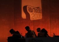
I’m a bit late to the party with this round-up, since @media ended last Friday. But I have excuses you see ..
In short I have to say I enjoyed @media 2006 more. This year seemed (to me) to be much more designer focused with fewer technical topics. It was an excellent event, well executed with some great speakers – but with the huge amount of sketching going on, I found myself surrounded by those who ‘push the crayons’ – so to speak.

Leaning for power cords
On leaving I had the feeling that I had heard most of it before, yes, possibly at last years event. I also preferred last year’s venue, the grand scale of the Business Design Centre in Islington gave the impression that there were fewer attendees. Although I’m sure if you counted up, you’d find more people here this year. The absence of wi-fi seemed to be another common complaint.
All-in-all it was definitely worth going to. I only took a couple of photos (many more on flickr) and notes during the whole event (rumple.. crumple..) To sum up a few of the talks;
Beyond Ajax by Jesse James Garrett – After explaining a bit about some of the interesting work going on at Adaptive Path, Jesse talked about the ‘elements’ of user experience, mentioning MeasureMap as an example for gathering site data and VisualVocab as a useful tool.
Designing from the Outside In by Tim O’Reilly – A great talk on focusing on the outer layers first, and working in through UI → Logic → Data. A few good examples included the iPod vs. Earlier Rio MP3 Players, Google Calendar. He also pointed to Flickr’s User Experience Strategy. Experience is the product or real source of value for users.
Diabolical Design by Jason Santa Maria – I considered this the best talk of the event. I do not consider myself a designer by any means, but I am very keen to see the mindset and processes they go through. Design is intent, pointing to some favourite sites, AIGA, Ellis Lab, AFilm, Good Magazine. Gave great examples of colour choice. Repeated the fundamentals, left to right, top to bottom, big to small. Spiralling out from a focal point and attention to layout. For approaches to layout and colour design, work with grids and breaking them up in different ways, and grey box approach (more than just a wire frame). To feel out relationship of type with the chosen grid.
Interface Design Juggling by Dan Cederholm – A solid talk on re-use in the design process, using a fictional example site ToupeePal.com to show off techniques. Some good sites mentioned: Web Typography.net, TanyaMerone.com and Delta Tango Bravo (favicon collection)
“When Web Accessibility is *not your problem":http://joeclark.org/appearances/atmedia2007/ by Joe Clark* – A bit of a controversial talk from Joe, with, ‘font-size is not your problem – it’s the browsers’, ‘html is inadequate for all possibilites’ etc. He also mentioned he was ‘retiring’ from web accessibility. This talk got a fair bit of stick from some attendees in the Advancing Web Accessibility
talk the following day.
Technorati should point you to more complete summaries of the event, and full pod-casts will be available soon. I should also mention that Jon Hicks presentation on How to be a creative sponge and High-Noon Shoot-Out: Design vs. Implementation by Drew McLellan and Simon Collison were very entertaining.
Some recommended reading suggested; Elements of Typographical Style and Thinking with Type
